Andrew Sharratt Design: a case study
I love working with a diverse range of clients. I’ve worked with large corporations and small businesses. Start up enterprises and well-established companies. I learn from each and every project. Each website revamp reveals new challenges to overcome.
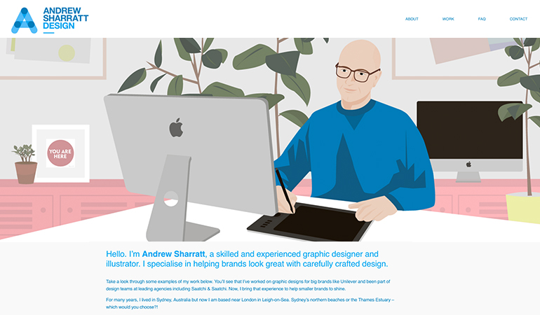
Andrew Sharratt Design is a small design business. It promotes and showcases work for the freelance graphic designer and illustrator, Andrew Sharratt.
His graphic design business has evolved and now offers more services such as illustration. This is why Andrew asked me to help revamp his website.
The problem
Andrew’s website looked good, but it wasn’t as effective as it could be. As you’d expect from a design professional, the visuals were fantastic! It looked great, but the copy was a bit dull and it wasn’t reaching its potential performance-wise.
I thought the copy felt stale and overly formal. There were some obvious copy and paste sections. The tone didn’t seem to match the design brand and its striking visuals. It needed to be livened up.

The solution
The website copy revamp:
The first thing I did was to review the tone of voice. I gained an insight into the ideal audience, and wrote a strategy that would connect with them.
I devised a new format for the copy. Instead of lengthy paragraphs, I wrote short chunks of copy. Mindful of users scanning pages (rather than reading in full), I create clear headings and a better layout.
Importantly, I added personality to the copy to lift it. It’s not a stuffy, corporate website. It’s a creative, professional design brand. The copy needed to be more chatty, a more relaxed style. It needed to use the words that its audience would use. This is my speciality.
The SEO revamp:
Ever mindful of the target audience, I conducted keyword research to find relevant phrases. Once the SEO keywords were defined, I produced a strategy. Then, the words were woven into copy, titles and metadata.
New website content:
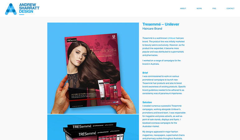
A key factor here relates to the new tone of voice. I wanted to increase the storytelling rather than presenting facts. When showcasing his work, I wanted to contextualise the eye-catching visuals. The previous website relied solely on the image. I wanted to provide more information and tell the story of the project.
I added an FAQ section to provide additional information in a scannable format. The former website condensed it all into the About section. The new content is so much more user-friendly and will work better for SEO.
New website layout:
With new services on offer, the website needed to sell them well. Reworking the homepage to highlight the three new streams of work – print design, illustration, branding – made this super clear and obvious.
I contributed to decisions on how to rework the layout and the look and feel of the site redesign. I worked with Andrew on how to present the information in a usable and accessible way.
The result is a clear, easy-to-use website with more relevant and compelling content. It promotes his work better. It engages with his target audience. It looks good, works well and reads far better than it did before.
“You’ve made me sound great! So much better than I could have said myself. I’m really proud of my website now and I’ll feel more confident showing it to potential clients.”
Andrew Sharratt
Take a look at Andrew Sharratt Design website
Does you need a website revamp? Please get in touch to chat about your content needs.
How do I work?
- Initial discussion to understand what the client likes and doesn’t like about their current website. Information on their ideal client(s). Understanding of their services and ideal outcomes.
- Access the data to inform decisions on what users viewed most.
- Thinking time.
- Suggestions, ideas and decisions on next steps.
Sound good? Let’s chat

